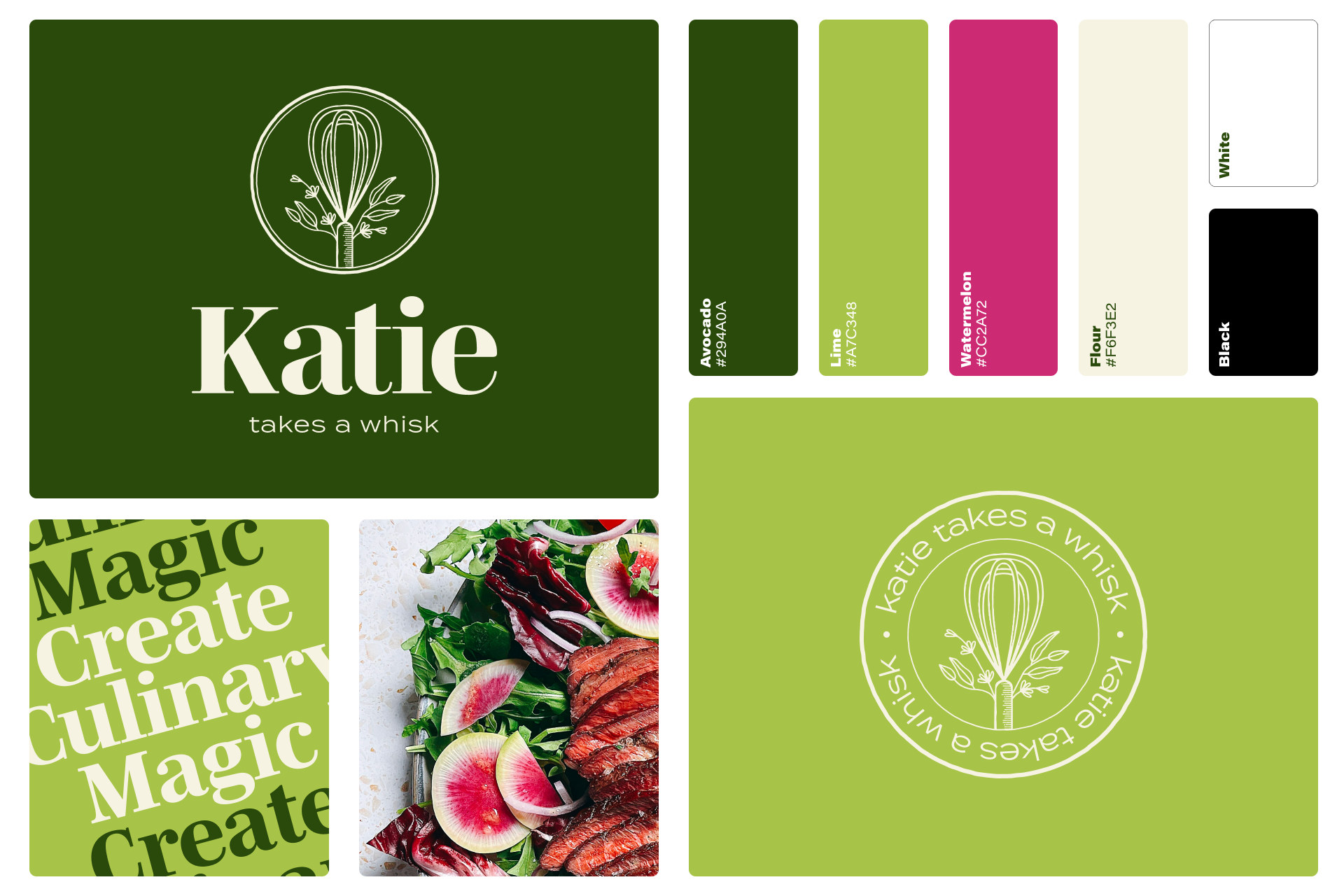
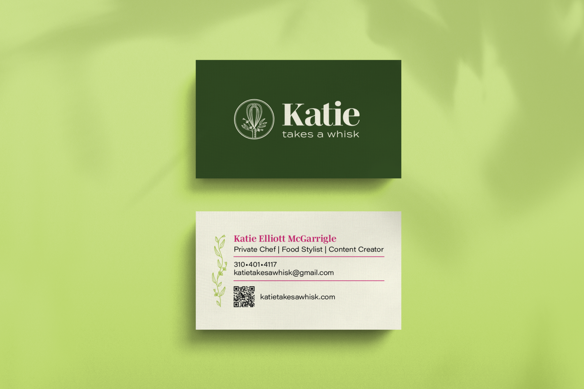
Katie Takes A Whisk is a private chef service that provides in-home meal service, meal prep delivery, and dinner party menus by a trained chef with a culinary degree and background in recipe developing and food styling.
I worked with Katie to create a visual identity system for her brand that would be used across a variety of business collateral in both digital and print mediums. The brand needed to capture her personable and friendly demeanor, her professionalism and reliability, and the natural ingredients used in her meals.
Katie Takes A Whisk Visual Identity
Deliverables:
Logo, Color Palette, and Typography
Visual Identity Guidelines
Website Design and Build (Squarespace)
Secondary Brand Design
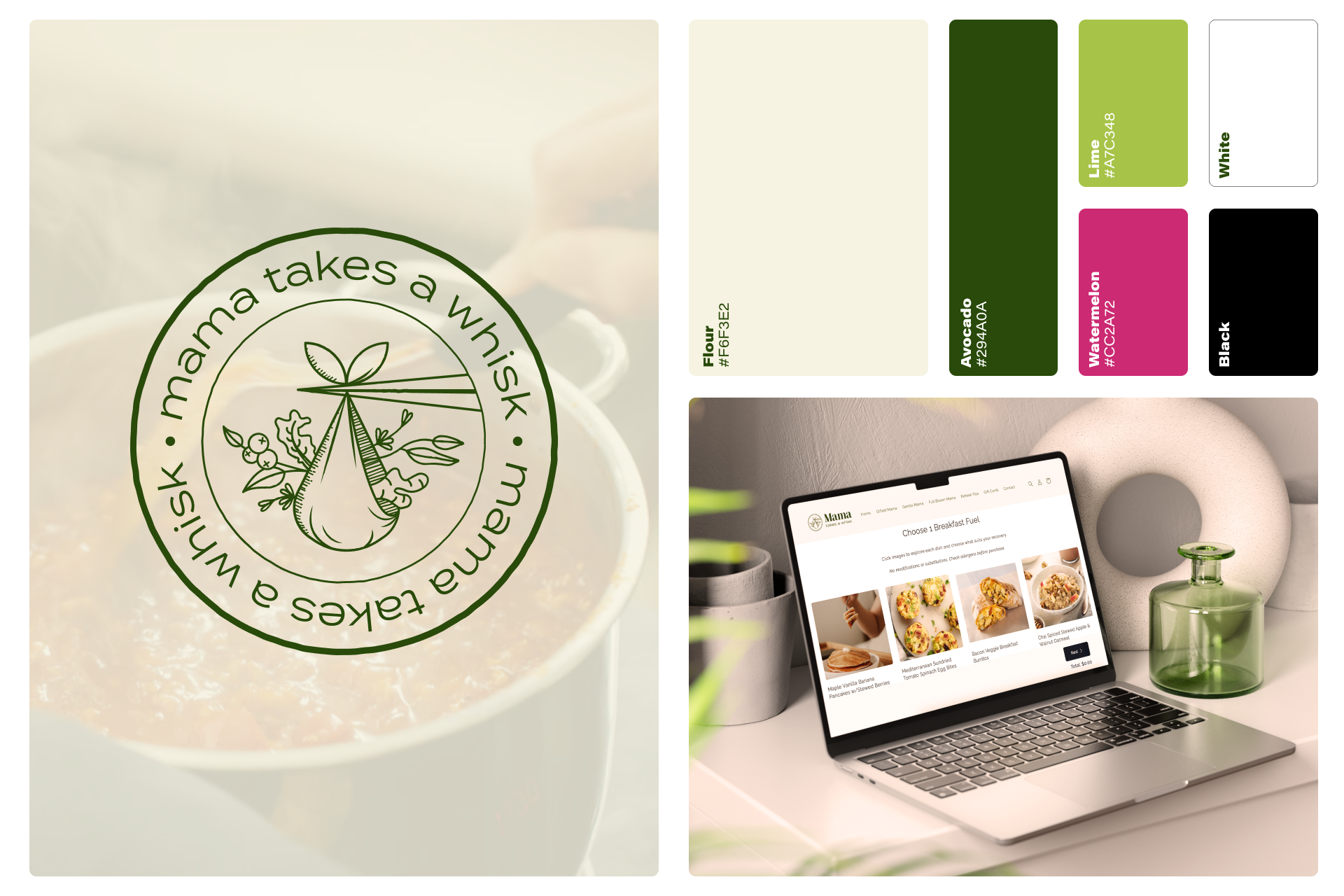
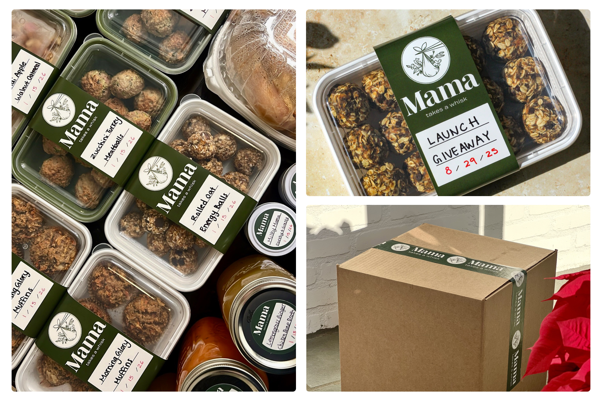
Mama Takes A Whisk Brand Extension
Katie expanded her offering into a secondary brand, Mama Takes A Whisk. This service offers thoughtfully crafted, nutrient-dense postpartum meals designed to support healing and nourishment.
This new brand extension needed it’s own identity while keeping visual connectivity to the original visual system.
Storks are widely recognized as symbols of new beginnings and motherhood. In folklore, they were believed to have delivered the babies to the mother. This symbolism parallels the idea of Katie delivering nourishing meals to postpartum mothers and families. This logo depicts a stork beak holding a care package for the mama stylized in the same recognizable look of the original Katie Takes A Whisk brand.